MARFUZ : Visual Poetry in Men’s Skincare Branding
Marfuz, Inc. / February 19, 2022

© 2022 Marfuz, Inc. - Image by Marfuz, Inc. / Official Release on February 19, 2022
In this visual creation, I sought to encapsulate not just a product, but a philosophy — the timeless intersection between masculine identity and self-care. MARFUZ: Men’s Quality Skin Care emerges not only as a branding message but as a celebration of crafted simplicity, tactile balance, and golden warmth.
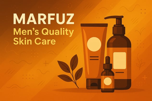
Rendered in a monochromatic spectrum of amber and burnt sienna, the image radiates a sense of both modernity and nostalgia. Each hue is meticulously chosen to evoke warmth, confidence, and trust — values intrinsic to a man’s skincare ritual. This tonal harmony creates a visual rhythm, much like a well-composed ballad, where each note supports the next to tell a deeper story.
The composition is a dance between design and nature. On the right, the trio of skincare containers — tube, pump bottle, and dropper — stand as totems of care and rejuvenation. Their vertical arrangement invokes strength and structure, while their soft curves and rounded edges echo a quiet gentleness. They are unbranded in detail, deliberately so, becoming symbols rather than products — universal vessels of transformation.
Offsetting this precision is a botanical motif: three leaves, subtly stylized, grounding the arrangement in organic authenticity. This detail draws the viewer inward, inviting a deeper contemplation of balance — between man and earth, product and purpose.
Typography plays an essential visual role. The bold, sans-serif MARFUZ anchors the image, embodying reliability and masculine elegance. Below it, the text "Men’s Quality Skin Care" flows in a warm beige, harmonizing with the background gradients and guiding the eye with quiet authority. The use of rounded typeface juxtaposed with sharp linear shadows creates a layered reading experience — much like a good fragrance, revealing itself in notes.
In the background, decorative graphic lines and abstract symbols offer a subtle kinetic energy — movement without noise. They soften the rigidity of the layout, echoing the unpredictable beauty of natural textures: wind over sand, ripples over still water, the hum of life beneath quiet surfaces.
This piece lives at the convergence of commercial photography and graphic design — a hybrid of visual disciplines. As a photographer, my intent was not to simply display product, but to create an immersive brand world. One where light is language, color is emotion, and every element speaks of care — not only for the skin but for the self.
“MARFUZ” is not just a skincare visual — it is a narrative. A quiet rebellion against neglect, a modern ode to masculine elegance, and an invitation to rediscover the art of personal ritual.